During my last day of the Google Journalism Fellowship at the Poynter Institute of Media Studies, the amazing people there asked me to teach. Yes, me. A recent graduate with no experience whatsoever.
Me: Do you want me to introduce you? @GurmanBhatia: No, I don’t need an introduction after two months. pic.twitter.com/oUqQtwxhBi
— Kristen Hare (@kristenhare) September 11, 2015
So I stood in front of experienced folk including Kelly McBride, Roy Peter Clark and my editor Seth Liss, and digital experts such as Katie Hawkins Gaar, Vidisha Priyanka (via Google Hangouts,) Ren LaForme, Kristen Hare and Ben Mullin, and shared a bit about why code and design are key to journalism. Here are five tricks that you can use starting now:
Lesson 1: Your browser is your best friend. Make the most out of it.
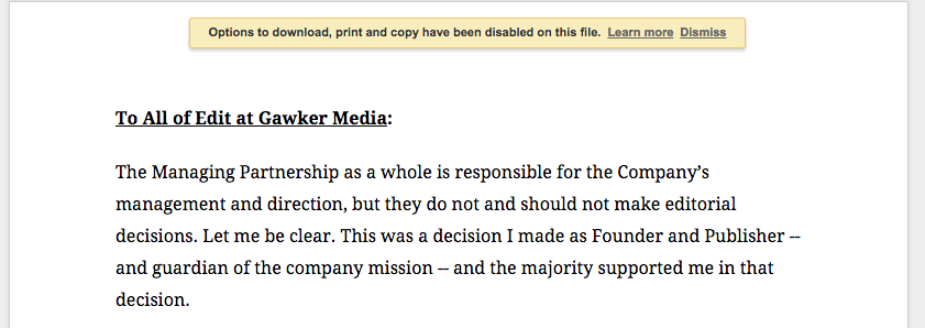
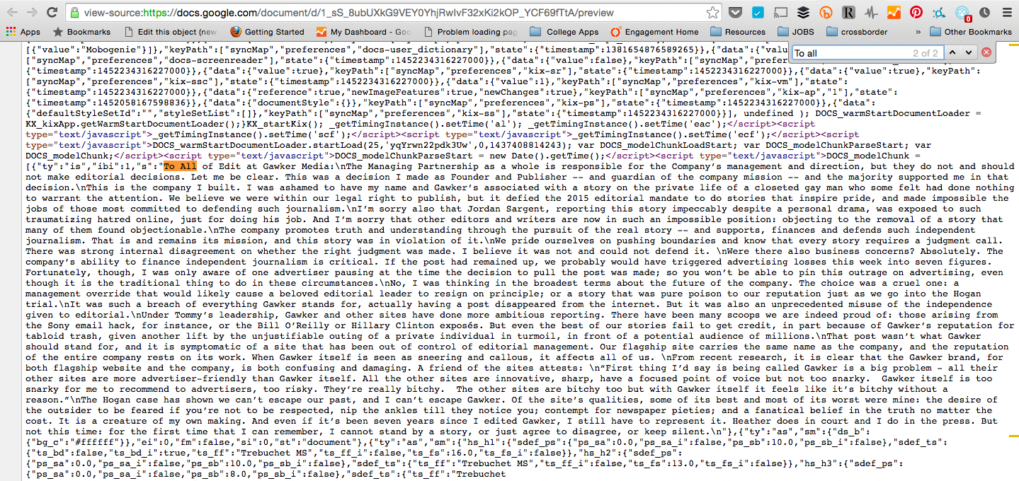
We are in the middle of a breaking news event and we get a memo. Only, the memo is in Google docs and the company has disabled copy/paste access. In a typical Poynter scenario, we would summarize the memo in 2-3 paragraphs and then paste the entire thing for the readers to see. Only we can’t exactly copy-paste the text. So what do you do in this case? Inspect element! In Chrome I would go to View > Developer > View Source. I then searched for the first few words of the memo – and there in the HTML is the entire text of the docs available to copy and paste.
Inspired? There are several other stories of the web inspector playing a crucial role in reporting.
Lesson 2: When writing articles about products or processes, use gifs to show them!
At Poynter, we write a lot about new digital products and innovative storytelling experiences. And we do that on deadline with a small staff. To illustrate the same, we often use screenshots. But here is the thing, interactive stories aren’t static. And they don’t deserve to be trapped in static experiences. So use gifs to show processes! Why? Because, social. When Instagram added a new feature, Ben Mullin posted a gif of it in action – something that got plentiful engagement in return!
Instagram debuts discover for Web, which can help publishers find user-generated content: http://t.co/iNIiOCmplc pic.twitter.com/v0ljuS49n2 — Poynter (@Poynter) July 20, 2015
Bonus: If you don’t know how to GIF. This presentation by Lena Groeger has some amazing tutorials.
Lesson 3: But… Don’t get carried away. Don’t force interactivity where it is not required. Story over medium. Think of User Experience.
Just because you know how to do fancy things, doesn’t mean you have to do them. It is key not to force interactivity where it is not required. Forgive my obsession with GIFs, but when Kristen Hare wrote this amazing story about a newspaper giving its front page to an artist for 26 days, we wanted to show the different covers in a GIF for social. I mean, it sounds meant for Twitter, right? And we did use it there.
This newspaper is giving its front page to an artist for 26 days http://t.co/ujdOycQa9h What’s your favorite so far? pic.twitter.com/VhbAsR61hf
— Poynter (@Poynter) July 22, 2015
At the same time, we decided against placing it in the actual story because that would interrupt the reader’s flow and would be plain distracting.
Lesson 4: When thinking of design, minimalism is the way to go. Concept over features. When it comes to graphics, iterate and edit. Just like any other story.
For me, graphics are the heart of a news organization. If you follow Kristen Hare’s front page of the day everyday, you are a print nerd. I mean, I personally think print is beautiful. And here is the thing about effective graphics – they are smart ideas presented in a simple fashion. Data and design nerds life me worship people like Edward Tufte that have argued for years, that it is key to get rid of those grids and unnecessary borders. 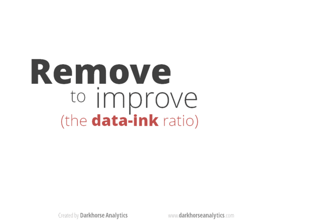
Stating from experience at Poynter, here is an example of a graphic that I did in under 10 minutes.
Roy Peter Clark, one of the best writing coaches of the country speaks about the difference between “reports” and “stories” time and again. While teaching, he will take a white board and list the differences. So when he wrote this article, my reaction was instantaneous – where was the white board?
So Roy wrote down the differences for me on a piece of paper and I opened photoshop. Stripe at the top and bottom, free icons from the Noun Project and some words in bold. It is not that complicated. If you don’t have Photoshop, you can also do something similar in a free software like GIMP.
The result? Again, great for social! The image got shared over 300 times on Facebook. And now Roy gets to use it as a handout for his classes as well.
Lesson 5: Collaborate!
One of the best lessons I learnt at Columbia Journalism School came from Giannina Segnini. “You can either do it alone and finish it in two years, or work together with three other people and do it in two months,” she said on the first day of class.
In a field like journalism where everything we do is time sensitive, it is key to learn to collaborate. Nerd teams in most news organizations are precisely that – journalists, reporters and designers sitting on the same table from the beginning of a project – brainstorming ideas.
Yes, a developer can be a reporter and a reporter can make motion graphics. It is important to acknowledge that possibility as well. But very often these skills are going to be isolated and learning to ask for help is key.
During my time at Poynter reporters learnt to approach me with ideas to enhance their pieces. Often I had ideas to improve existing things. So we worked on those together. Moral of the story? Find that one crazy doodler in the building and ask them to sketch caricatures for your next story.